How a digital device affects the Design of a Website?
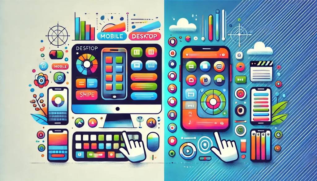
Mobile vs Desktop Usability
We live in a much more digital world today compared to 10-20 years ago. People now expect a simple flawless experience whether they are browsing the web using a desktop or a smartphone.
Designing for usability on a mobile device is different from a desktop due to the different ways that you interact with each device. A well-designed mobile app is not just a smaller version of a website, it must be changed and optimised for touch-based interactions.
Key Differences Between Mobile and Desktop Design
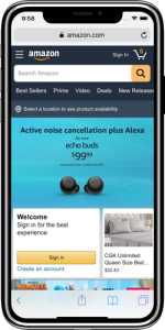
The experience of using a mobile and desktop device varies in many ways. On desktops, users usually have a large screen, this means designer have more room for layouts, larger images and navigation options. These larger screens allow for features such a drop-down menu which gives the user more control on what they want to view or browse.
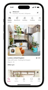
Mobile devices are more simplified. Mobile devices are much smaller screens and include touch navigation. Mobile apps or websites often have larger text and bigger buttons to make it easier for the user to tap and read. Designer must take into account the size of the buttons so that they don’t take up the whole screen, but also ensure the users can easily press the buttons with the thumbs.
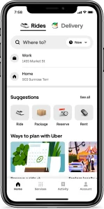
Navigation also works differently for the two devices. Desktop websites often include detailed menu systems, whereas mobile websites rely on icons or swipe features to save space. These features ensure the mobile experience is still easy and smooth to use, even on a small screen.
Making a Mobile App Easy and Fun to Use
To make a mobile app easy to use, it is important to keep the design simple and straightforward. Every screen should have a purpose, this makes it easier for the user to find what they are looking for and complete tasks easily.
Touch friendly design is one of the most important aspects in mobile usability. Buttons must be large an easy to tap, enough space must also be between button to avoid tapping the wrong button. Text must clear and readable, without having to zoom in and images must be of good quality.
Features such a location services and push notifications can make an app even better on a mobile device. For example, location services can be used to show the user nearby stores or events. Push notification can also be used to give the users any relevant updates. Swipe features also makes it easier for the user to browse content, especially in apps with large amount of images.
Avoiding Common Mobile Usability Issues
There are a number of challenges that designers may face when deigning a mobile app.
Cluttered screen is a common problem and it is an issues because it can make people feel overwhelmed. Because of this, designers must focus on the essentials and keeping things simple.
Another issue is when navigation features are not consistent. Users need a predictable layout when navigating the app to make their experience more enjoyable. Using consistent patterns, such as side tabs, helps the users understand what section of the website or app they are in and how to get to other sections easily.
Performance is also vital for a mobile website or app. If an app is slow to load, users will often just give up or leave. Designers must optimise performance for the app by compressing images, removing, or reducing animations or providing less data. Testing the app on different devices or on different network speed can often highlight any speed issues the user may face.
In summary, designing a website for a a mobile or desktop app involves adapting to the different ways that people use the devices.
While mobile and desktop usability share a common goal, they differ in performance and restrictions. With a focus on touch friendly design and smooth enjoyable experience for the user, mobile apps can be just as effective as any desktop site.
Keeping things clear and responsive and avoiding downfalls, such as cluttered screens ensure that users can stay engaged with the content and achieve their required goal.